/genjutsu:paintfrom a written brief
Slack water, posted like a harbour notice
the first message
/genjutsu:paint build the landing page for Étale.
The brief. Étale is a fictional product, made up for this example, and this is everything we, its founders, have:

- Étale is an iPhone app for people who swim in the cold water of Aquatic Park, San Francisco, all year round. It answers one question before you walk down to the beach: when is the water slack (étale is the French word for slack water, the still moment between ebb and flood, when the current is weakest), and how strong the current runs between two slacks.
- Its numbers come from two NOAA CO-OPS stations, and data/tide.json holds one real day of both, 2 October 2026, as fetched from NOAA: the tide predictions of station 9414290 San Francisco, and the slack water and current predictions of station SFB1204 (Alcatraz Island, southwest of, the closest predicted current station, in the bay off the cove). The file names each station, where it is, its datum and its units. Use those numbers and label each one with its date and its station. Slack water is not high or low tide: take the slack times from the current predictions. The app shows no water temperature, so the page must not either. Do not invent any other figure.
- The swimmers it is for train there before work, mostly without a wetsuit. They already know the cove and read the tide themselves on a printed table or a weather site. They want the next slack window at a glance, and an alert the evening before.
- What exists: an iOS beta on TestFlight. No Android, no web app, no prices, no user numbers, no testimonials. The page has one job: get a swimmer onto the TestFlight beta, at /beta.
how it was made
- genjutsu
- 4.1.0 at 09c177b, with the fix/skill-arguments branch, the 4.1.1 candidate
- model
- claude-opus-5-5
- run
- A conversation with an agent playing the client, 10 exchanges
- harness
- bin/converse.mjs on Claude Code 2.1.289, sandboxed, one headless call per turn on the same session
- selection
- First pass, the only run recorded
- cost
- $3.55, 54 turns, genjutsu only. The agent playing the client: $1.08 more
- date
- 4 October 2026
- scope
- /genjutsu:paint, from a written brief
- modules
- tells, ui-ux-pro-max, motion-principles, css-native, mobile-principles, design-audit
What to know about this run
- A conversation: genjutsu asked its questions and showed its gates, and an agent playing the founder answered from a written brief (etale/client.md), without ever seeing the code. Ten exchanges, every one of them below.
- Run with the fix/skill-arguments branch, the 4.1.1 candidate: 4.1.0 at 09c177b plus the fix for the skill-argument bug the invoice-mark-paid run found. The plugin still reports itself as 4.1.0.
- First pass: one conversation recorded, and this is it. Built as the run left it, with no human edits, on the first try.
- $3.55 is genjutsu's cost: 54 turns over 10 min 35 s. The agent playing the client cost $1.08 more, which is not counted as genjutsu's.
- The client pushed back twice. At exchange 2: the evening alert matters as much as the slack window, so it sits beside the slack card from then on. At exchange 8: the hero card skipped the flood before the 05:57 slack, so the run added that row, read from the data. Both theses held at first showing.
- The design-system lookup proposed navy and gold, Inter 900, star ratings, a screenshot carousel and a Play Store button. The run dropped all of it and said why: none of it fits the thesis, and the ratings and the Android app do not exist.
- Two defects, both shown as the run left them. The dashed slack lines cross the chart labels at every width, a check the run handed over instead of making. And the current line draws on load, as the thesis says, but the chart sits below the fold, so a visitor who scrolls down finds it already drawn; the run said so itself.
- Every figure on the page is in data/tide.json, and there is no water temperature. The -07:00 offset in the hero is typed in, right for this date only, and the run disclosed it.
- Its own audit: 11 checked, 4 problems, all fixed, 3 browser checks handed over. The tells audit: 18 checks, 0 findings.
The conversation
genjutsu on one side; on the other, an agent playing the founder, answering from a written brief (etale/client.md) and never shown the code. What genjutsu asked at each gate and what it was told, then every turn as recorded.
- 02genjutsuIs my read of the brief right?clientYes, and the evening alert matters as much as the slack window.
- 03genjutsuWhat should the page feel like when they check it, and what would feel wrong?clientQuiet, grey, exact, a bit early-morning. A harbour notice, nothing bright or sporty.
- 04genjutsuLight, like a printed sheet, or dark, like a phone at 5:30?clientThe phone in the dark hallway. Grey and quiet, not black and glossy.
- 05genjutsuHow do you want to see the proposal?clientA, a rendered page under preview/.
- 06genjutsuDo both theses hold, as written?clientBoth hold. Keep the accent, the typeface and the motion.
- 07genjutsuBuild from this design system?clientYes, start with the hero.
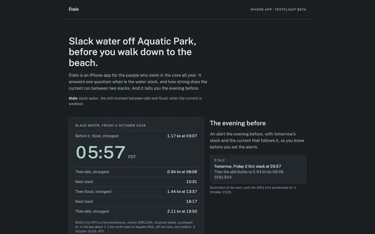
- 08genjutsuDoes the hero hold?clientOne thing missing: the flood before the 05:57 slack, 1.17 kn at 03:07. Added from the data.
- 09genjutsuDoes the chart section hold?clientIt holds.
- 10genjutsuDoes the footer hold?clientIt holds. Go ahead with the audit.
- endgenjutsuThe final report: four problems found, all fixed, three browser checks handed over.clientDone.
Read the whole conversation10 exchanges · 20 turns · as recorded
Verbatim conversation from the recorded run (runs/conversation-2). Every U+2014 em dash would be replaced by “ - “; the source held none, so nothing was replaced and nothing else was changed. Checked: no email address, no home path, no token (the word “tokens” below means design tokens).
client01
/genjutsu:paint build the landing page for Étale.
The brief. Étale is a fictional product, made up for this example, and this is everything we, its founders, have:
- Étale is an iPhone app for people who swim in the cold water of Aquatic Park, San Francisco, all year round. It answers one question before you walk down to the beach: when is the water slack (étale is the French word for slack water, the still moment between ebb and flood, when the current is weakest), and how strong the current runs between two slacks.
- Its numbers come from two NOAA CO-OPS stations, and data/tide.json holds one real day of both, 2 October 2026, as fetched from NOAA: the tide predictions of station 9414290 San Francisco, and the slack water and current predictions of station SFB1204 (Alcatraz Island, southwest of, the closest predicted current station, in the bay off the cove). The file names each station, where it is, its datum and its units. Use those numbers and label each one with its date and its station. Slack water is not high or low tide: take the slack times from the current predictions. The app shows no water temperature, so the page must not either. Do not invent any other figure.
- The swimmers it is for train there before work, mostly without a wetsuit. They already know the cove and read the tide themselves on a printed table or a weather site. They want the next slack window at a glance, and an alert the evening before.
- What exists: an iOS beta on TestFlight. No Android, no web app, no prices, no user numbers, no testimonials. The page has one job: get a swimmer onto the TestFlight beta, at /beta.
genjutsu01
Scanning the ground before the first brushstroke.
Scan done: React 19 + Vite + TypeScript, plain CSS, no animation library, no existing visual identity (
index.cssis a reset,App.tsxrenders an empty<main />).data/tide.jsonhas the full day for 2 October 2026: the 9414290 tide curve at 6-minute steps, two highs and two lows, and three slacks plus four current maxima at SFB1204 (05:57, 10:31 and 16:17 PDT, with a 2.11 kn ebb at 19:50).It’s one landing page, not a multi-page site, so I’ll use this pipeline rather than bunshin. With no existing design, there’s no preserve-or-redesign question.
My read so far: a one-page TestFlight signup for Étale, an iPhone app that tells year-round, mostly no-wetsuit swimmers at Aquatic Park when the next slack water is and how hard the current runs between slacks. The readers already read tide tables and want the answer before they walk down to the beach. The direction I’m leaning toward is quiet, exact and set around the data: the real 2 October slack times as the main element, with every figure labelled by date and station, and no temperature or invented numbers. Stack: React + Vite + plain CSS, no animation library.
Correct me before I ask anything.
client02
That’s right. One more thing: the alert the evening before matters as much as the slack window, so don’t leave it out.
genjutsu02
Noted: the evening-before alert gets as much weight as the slack window. It won’t be a footnote.
First question, about mood. You know these swimmers and I don’t: at the moment they check Étale (dark, early, cold, before work), what should the page feel like, and what would feel wrong for them? For example, does a bright, sporty, “crush your swim” tone grate on them? Or is it something quieter, like a harbour notice or a printed tide table? Three to five words, or one thing they’d roll their eyes at, would be enough.
client03
Quiet, grey, exact, a bit early-morning. Like a harbour notice or the printed table on the club noticeboard. They’d roll their eyes at anything bright and sporty, or anything that sells cold water as toughness.
genjutsu03
“Quiet, grey, exact” settles the tone. Here’s the one fork your answer leaves open, and it decides the whole palette:
Should the page be light or dark? The harbour notice and the club table point to a light grey printed sheet: dark ink on a cool, flat grey, like a posted notice. “Early morning before work” points to a dark screen read before dawn, with grey-blue ink on near-black, the way a phone looks at 5:30. Both can be quiet and exact. They just feel like different objects. Which one is closer to how your swimmers actually meet the information: the noticeboard, or the phone in the dark hallway?
client04
The phone in the dark hallway. That’s when they actually check it, and the alert the evening before also comes in on a dark screen. Keep it grey and quiet though, not black and glossy.
genjutsu04
That gives me enough to write both theses: a dark, grey, quiet page built for reading in a dark hallway, laid out like a posted notice, with the slack window and the evening alert carrying equal weight.
Before I show them, how do you want to see them?
- A. Rendered page (recommended: a whole visual identity is at stake). A throwaway HTML file with the swatches and their contrast ratios, a type specimen, the easing curve plotted, and a slack card and an alert preview that actually move. This session can’t open a browser, so I’ll give you the file path to open.
- B. Live preview. A throwaway route inside this Vite project, using the real stack. It needs
npm run dev, which I won’t start without asking. - C. Inline. The two theses written out here in text.
client05
A, the rendered page. Please save each preview as a standalone HTML file in a preview/ folder in the project so I can open it.
genjutsu05
Painting the preview: palette, type and the slack chart, all on a dark grey ground. First, checking contrast and the day of the week.
Visual thesis: a dark, cool-grey notice read on a phone in a dark hallway. The ground is flat slate (#1A1E21), the ink comes in three greys, and there’s one pale sea-glass accent (#A9CCC5) used only for slack water and the beta button. The typeface is Public Sans, the US federal web typeface, because it has the plain tone of a posted harbour notice and its figures line up in columns of times. Large numbers sit against small labels. Spacing is unhurried, but the data is set as tight as a printed tide table. Components are flat and sharp: 2px corners, 1px hairline rules, no shadows.
Interaction thesis: still, like slack water. Elements fade in and rise 8px over 480ms on one easing curve,
cubic-bezier(0.32, 0, 0.16, 1), 80ms apart, and play once on load. The current line draws once over 1200ms. Hover changes colour only, in 160ms. Nothing is tied to scroll. Forbidden: bounce, parallax, scroll reveals, looping animation, numbers that count up, anything sporty or heroic.Allowed patterns: hairline rules, small uppercase source labels under each figure, figures that line up in columns, a chart of the real SFB1204 current predictions, and the evening alert drawn in HTML as a notification, labelled as an illustration.
The preview below shows the proposal, not the build:
preview/thesis.html. This session’s sandbox can’t open a browser, so runopen preview/thesis.htmlyourself. It has:- the easing curve plotted, with Replay and Reduced-motion buttons;
- one real slack card and the evening alert, side by side and at equal size;
- the SFB1204 current chart for 2 October 2026. The dots are NOAA’s predicted slacks and maximums, and the lines between them are labelled as a reading aid, not as predictions;
- the swatches with their computed contrast ratios, the type scale, the spacing steps and the corner radii.
Every figure comes from
data/tide.jsonand carries its date and station. There’s no water temperature.Do both theses hold, as written? Or should anything change: the accent, the typeface, or how much motion there is?
client06
Both hold. It reads like our water: slack times from SFB1204, the source under every figure, the alert next to the slack card, and nothing sporty. Keep the accent, the typeface and the motion as they are.
genjutsu06
Both theses validated. Loading
tellsbefore the design-system query.tellsloaded. Running the design-system query with the validated thesis.Design-system query done. Writing MASTER.md and the tokens.
Rendering the design-system preview.
The design system is ready, on a rendered page in the same mode as before.
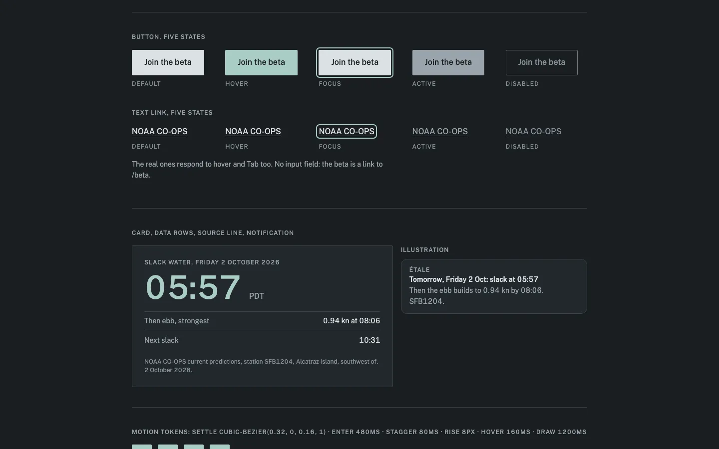
preview/design-system.html: open it withopen preview/design-system.html. It shows every token group, the button and text link in all five states (default, hover, focus, pressed, disabled), the card with its data rows and source line, the notification, and the motion settings with a Replay button. It’s a throwaway page; the real build will read the tokens fromMASTER.md.Files written
MASTER.md: the full design system, with both validated theses and the content rules from your brief.src/tokens.css: the same values as CSS variables. Nothing uses them yet.
What I took from the design-system lookup, and what I dropped
- Kept: its standard checks (tap targets of at least 44px, visible focus, reduced motion, testing at 375 to 1440px wide) and short colour-only hover changes.
- Dropped the palette: navy and gold, on a light background. It contradicts the dark grey thesis.
- Dropped the type: Inter at weight 900 with oversized text. That’s a reflex choice; Public Sans stays.
- Dropped the “app store” page layout: star ratings, a screenshot carousel and a Play Store button. All three would be invented: you have no ratings, no screenshots and no Android app.
- Dropped the GSAP motion code: I only read it for timing, and installed nothing.
Lookup settings, and where each value came from
- Layout boldness 3: from “flat and sharp… a posted harbour notice”.
- Motion 2: from “played once on load… nothing tied to scroll”.
- Density: not sent. The thesis pulls both ways (“unhurried” spacing, data “tight like a printed tide table”), so I set the spacing by hand.
Three things the page could pass off as decoration, all deliberate and listed in your allowed patterns:
- a thin rule on every data row;
- small uppercase source labels;
- the notification drawn in HTML, labelled as an illustration.
Two small additions to what you saw in the first preview
- The big slack time now grows to 4rem on wide screens; it was fixed at 3.5rem.
- I left out colours for success, warning and error, because the page has no form and nothing to report.
The font loads from Google Fonts through a
<link>tag. No npm package gets installed.Is this design system right to build the page from? If so, I’ll build the hero next (heading, slack card, alert and beta button) and show it to you before the chart and the rest of the page.
client07
Yes, build from it. Go ahead with the hero.
genjutsu07
Loading the implementation modules, one per call.
Building the hero: page heading, slack card, evening alert and the beta button.
Now the styles, all read from the tokens.
The hero is built and
npm run buildpasses, with type-checking and the Vite build both clean.What it shows
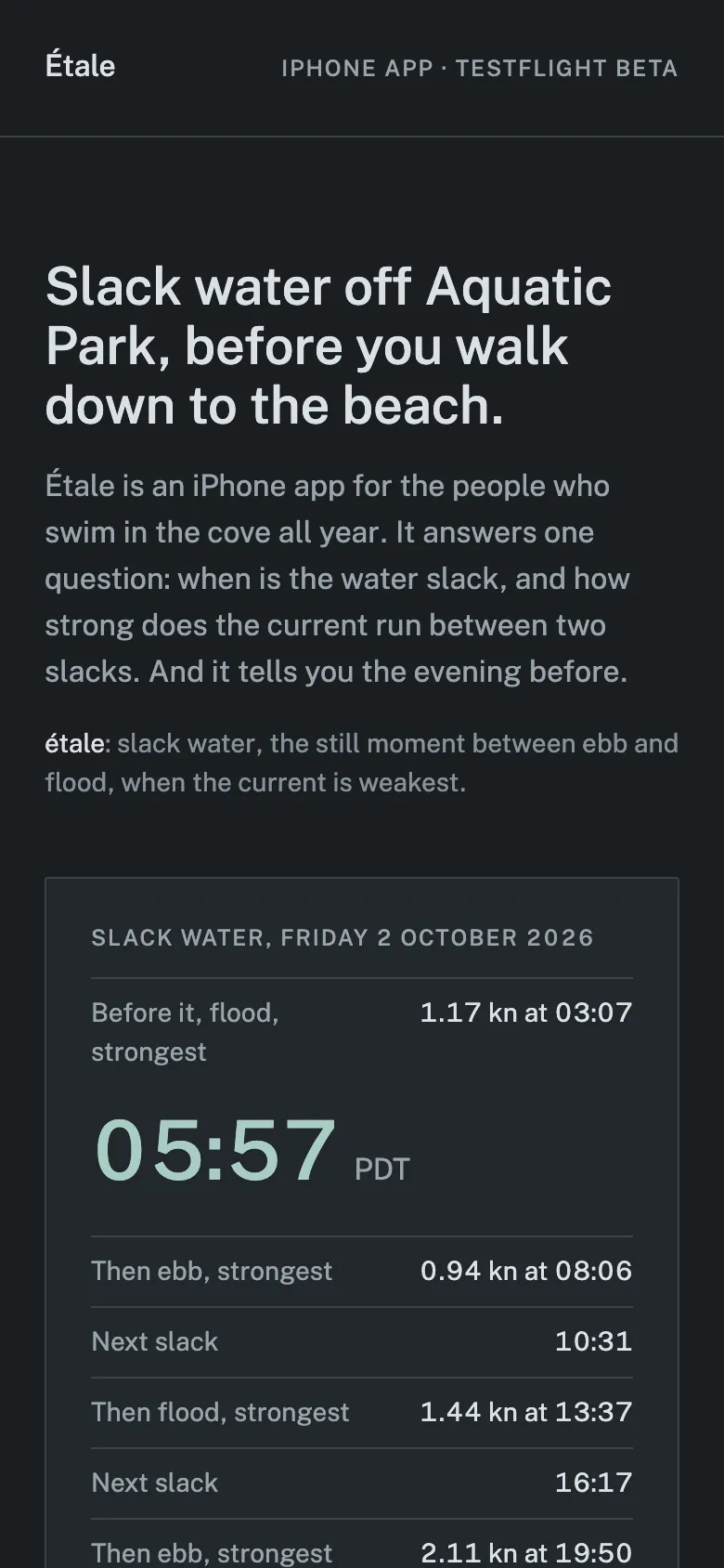
- Header: the “Étale” wordmark and “iPhone app · TestFlight beta”.
- Heading: “Slack water off Aquatic Park, before you walk down to the beach.” It says “off” rather than “at” because neither NOAA station is in the cove itself.
- Intro: one paragraph on what the app answers, then the definition of étale.
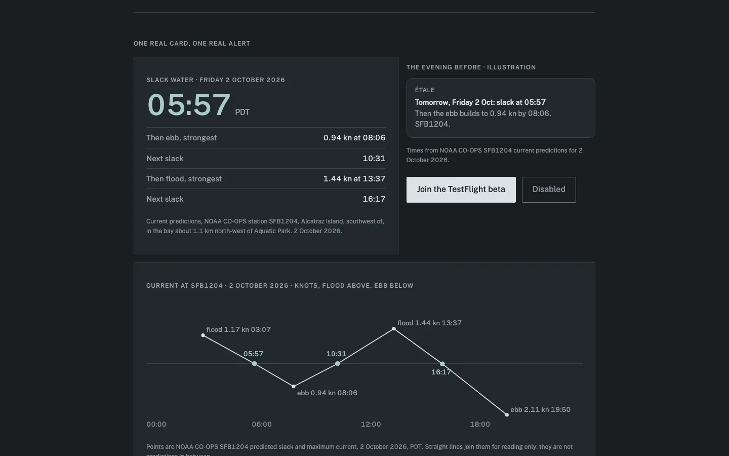
- Slack card: “Slack water, Friday 2 October 2026”, with 05:57 PDT in the accent colour. Below it, the rest of the day: ebb strongest 0.94 kn at 08:06, next slack 10:31, flood strongest 1.44 kn at 13:37, next slack 16:17, ebb strongest 2.11 kn at 19:50. A line underneath names station SFB1204, where it is, and the date.
- “The evening before”: sits beside the card, with its own heading and one sentence. Under them is the notification (“Tomorrow, Friday 2 Oct: slack at 05:57 / Then the ebb builds to 0.94 kn by 08:06. SFB1204.”) with a caption saying it’s an illustration using the SFB1204 predictions for 2 October 2026.
- Button: “Join the TestFlight beta”, linking to
/beta, with “iPhone only, through Apple’s TestFlight.”
How it’s built
- Every figure is read from
data/tide.jsoninsrc/tide.ts; none are typed into the page. - The slacks come from the SFB1204 current predictions only. There’s no water temperature.
- On load, elements fade in and rise 8px over 480ms, 80ms apart, once. With reduced motion on, they don’t animate.
- Hover changes colour only, and only on devices with a mouse. The button is at least 44px tall.
Files:
index.html,src/App.tsx,src/Hero.tsx,src/tide.ts,src/index.css.src/tokens.cssis unchanged.To see it, run
npm run dev; I haven’t started the dev server. I can start it if you want.Does the hero hold? If so, the next section is the full-day current chart for SFB1204, with the tide heights at 9414290 for comparison, so it’s clear slack is not high or low tide. After that comes a short footer with the NOAA source and a second “Join the TestFlight beta” button.
client08
The hero holds, with one thing missing. The card skips the flood before the 05:57 slack, 1.17 kn at 03:07, so it only shows how hard the water runs after slack and not before. Add it above the slack time, then go on to the chart.
genjutsu08
Adding the 03:07 flood above the slack time, then building the chart.
Now the chart and table styles, and adding the section to the page.
I added the flood before slack and built the chart section;
npm run buildpasses.Slack card: a row above the slack time now reads “Before it, flood, strongest: 1.17 kn at 03:07”. It’s read from the data like the rest: it’s whichever prediction comes just before the first slack.
New section: “Slack is not high or low tide.”
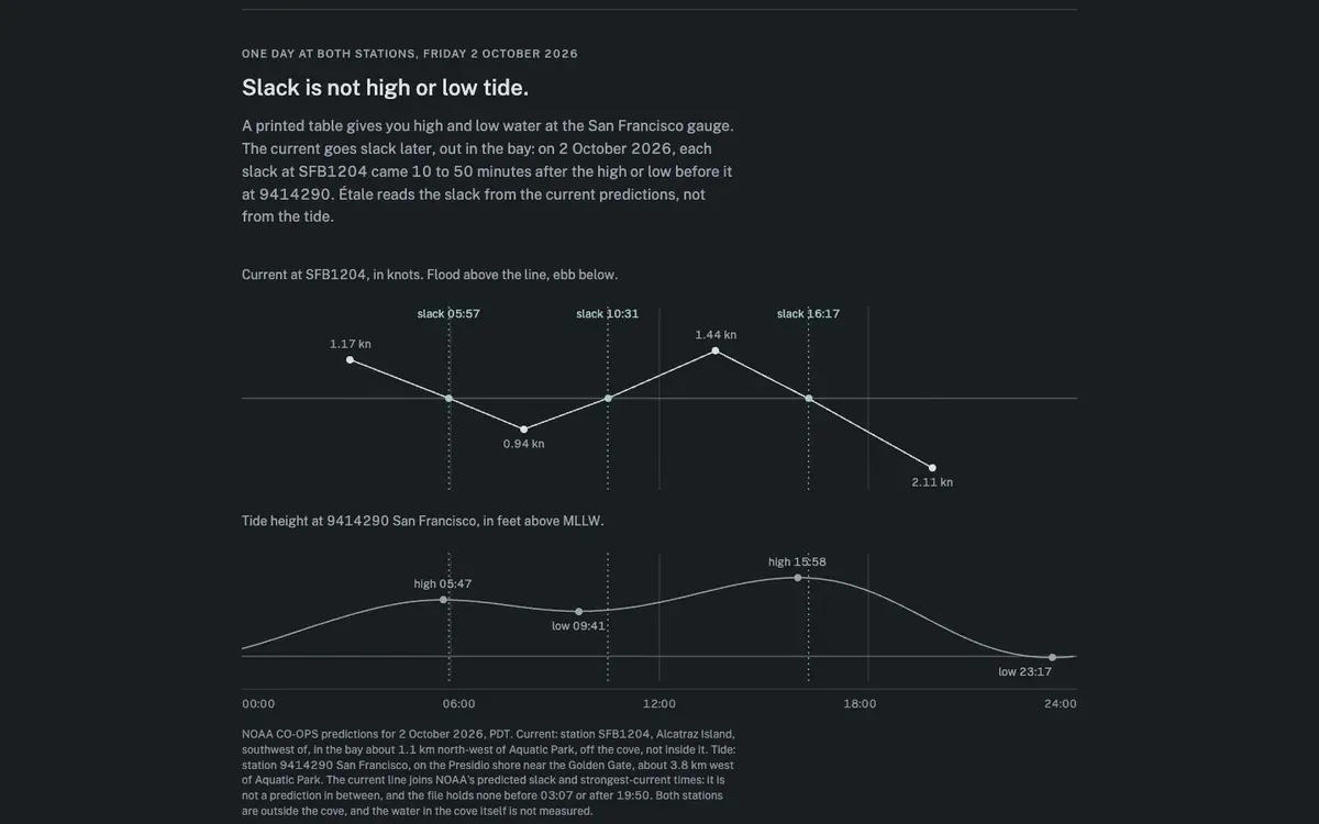
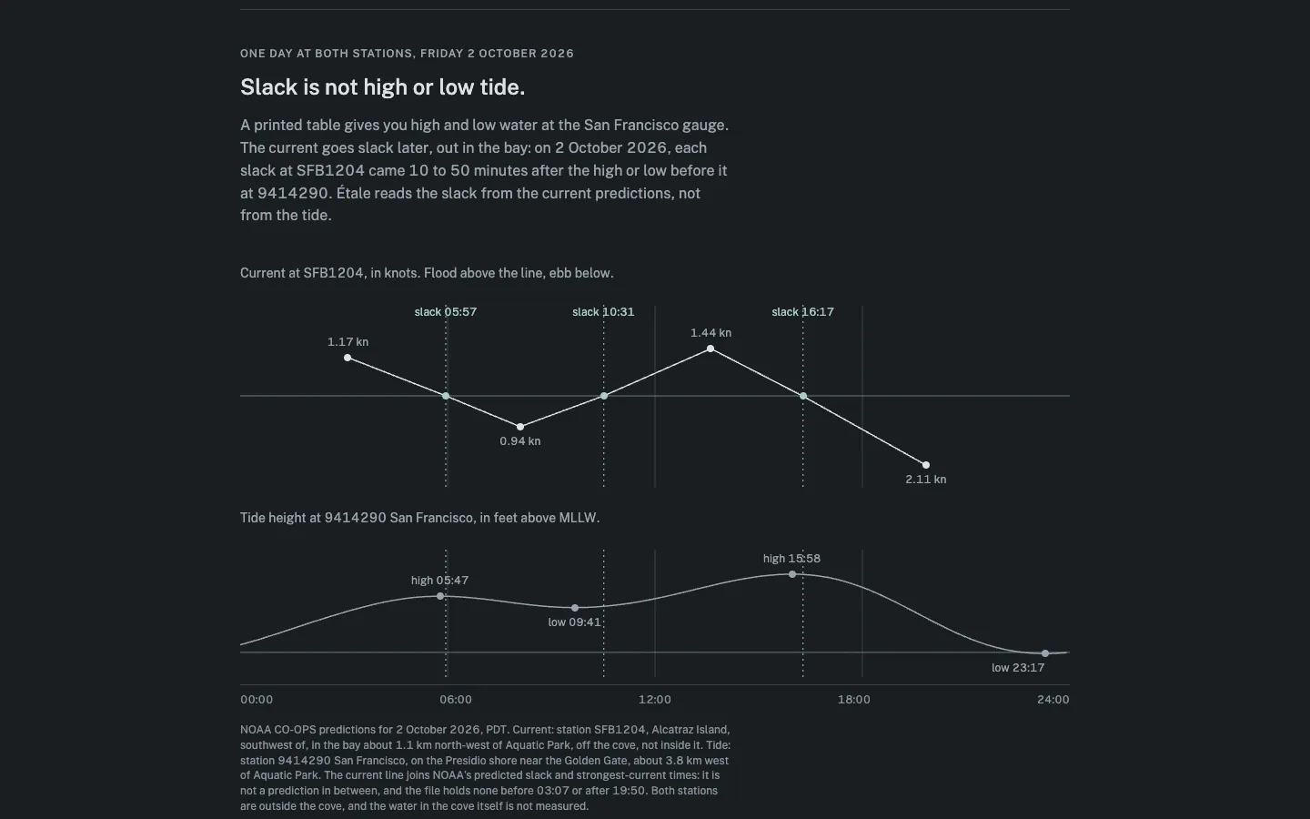
- Intro: one paragraph. A printed table gives you high and low water at the San Francisco gauge, but on 2 October 2026 each slack at SFB1204 came 10 to 50 minutes after the high or low before it at 9414290. The 10 and 50 are worked out from the data, not typed in.
- Current chart (SFB1204, knots):
- Flood plots above the line, ebb below.
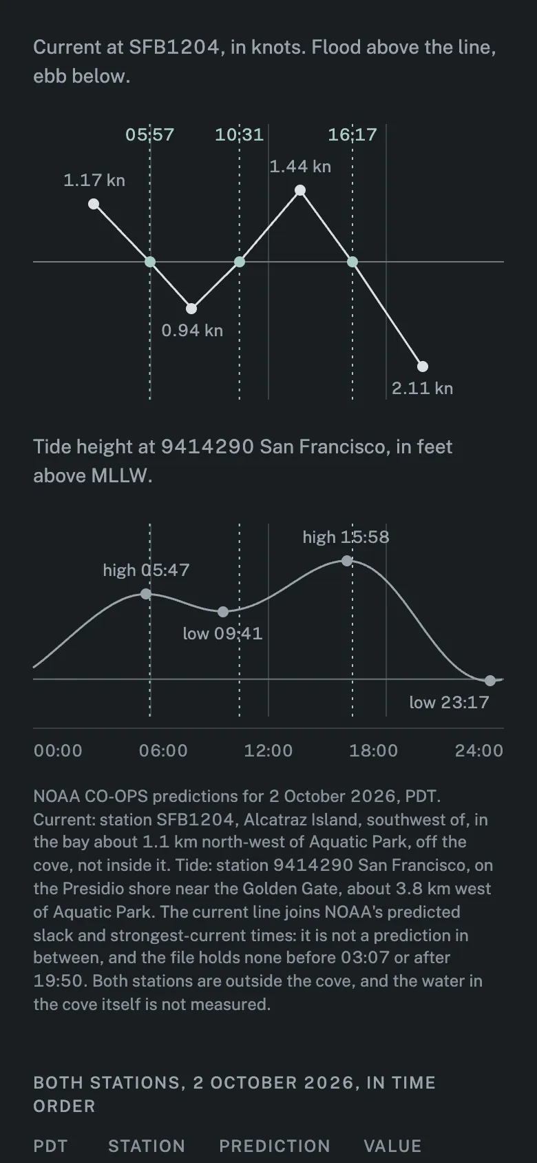
- The dots are NOAA’s seven predictions: slacks at 05:57, 10:31 and 16:17, and the strongest flood or ebb in between (1.17, 0.94, 1.44 and 2.11 kn).
- The line between them draws once over 1200ms on load. Then the dots and labels fade in.
- Tide chart (9414290, feet above MLLW): all 240 points at 6-minute steps, with high 05:47, low 09:41, high 15:58 and low 23:17 marked.
- Slack markers: dashed lines in the accent colour run down both charts, so you can see slack landing after each high or low.
- Caption:
- names both stations and where they are, plus the date and the time zone;
- says the line only joins NOAA’s points and isn’t a prediction in between;
- says the data has nothing before 03:07 or after 19:50;
- says the water in the cove itself isn’t measured.
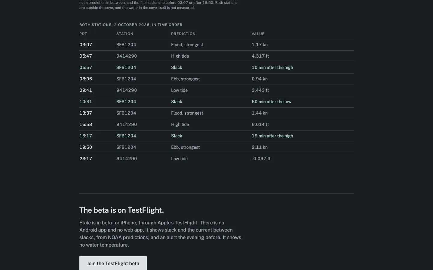
- Table: all eleven predictions from both stations in time order: time, station, what it is, and the value. The slack rows are in the accent colour and say how long after the high or low each came (“10 min after the high”). Screen readers get the table; the charts are hidden from them.
How the chart is built: the lines are SVG stretched to the page width, and the labels are HTML on top, so the text stays readable on a phone. Below 40rem the slack labels drop the word “slack” and show only the time, so they don’t overlap. I added two tokens,
--chart-strokeand--chart-dash, toMASTER.mdandtokens.css.Files:
src/DaySection.tsx(new),src/tide.ts,src/Hero.tsx,src/App.tsx,src/index.css,src/tokens.css,MASTER.md.The line draws on load, as the thesis says, not when you scroll to it. On a phone it will usually have finished by the time the chart comes into view.
Does this section hold? Next is the footer: a closing “Join the TestFlight beta” button, the NOAA source link, and a short line on what the app doesn’t show. After that comes the audit.
client09
It holds. Go on to the footer.
genjutsu09
My replace order clobbered the variable; rewriting the file cleanly.
The footer is built and
npm run buildpasses.Closing section
- Heading: “The beta is on TestFlight.”
- One paragraph: Étale is in beta for iPhone through Apple’s TestFlight. There’s no Android app and no web app. It shows slack and the current between slacks, from NOAA predictions, plus an alert the evening before. It shows no water temperature.
- A second “Join the TestFlight beta” button, linking to
/beta, with exactly the same label as the one in the hero.
Footer
- It sits outside
<main>, so screen readers treat it as the page footer. - The source line reads: “Figures on this page are NOAA CO-OPS predictions for 2 October 2026, fetched on 4 October 2026: current at SFB1204 and tide at 9414290. Predictions, not measurements, from stations outside the cove.”
- The two links go to the exact NOAA requests listed in
data/tide.json. - The bottom edge respects the iPhone safe area.
Files:
src/Closing.tsx(new),src/App.tsx,src/tide.ts,src/index.css.Does the footer hold? If so, I’ll run the final audit of the whole page.
client10
It holds. Go ahead with the audit.
genjutsu10
Loading the audit module.
Audit script done. Now the manual checks: the thesis against the code, raw values, and contrast.
Fixing four drifts this run introduced: the 600 weight the thesis never allowed, the raw 50% radius, the raw underline offset, and the undocumented 40rem breakpoint.
Rerunning the tells check after the fixes, and confirming every figure on the page traces back to
data/tide.json.The audit is done and the Étale landing page is finished;
npm run buildpasses. I checked 11 things here and found 4 problems, all now fixed. Three checks need a browser, so they’re listed at the end for you to run.Problems found and fixed
- A third font weight. The notification title used weight 600, but the thesis says two weights. I set it to 500 and dropped 600 from the font request and from
MASTER.md. - Raw value: dot radius. The chart dots used a bare
50%radius; it’s now the--radius-dottoken. - Raw value: link underline. The underline offset was a bare
0.2em; it’s now the--underline-offsettoken. - Breakpoints not written down. The 40rem and 52rem screen widths weren’t in
MASTER.md; they are now. CSS can’t use variables there, so the values stay written out.
The audit script still flags two things that aren’t real problems:
- “Hover with no transition” on
.btn:hoverand.link:hover. The colour change is set on the base rules instead (src/index.css:447and:484), so the hover does animate. - Inline heights on the two chart boxes (
src/DaySection.tsx:103and:165). These are fixed sizes that match the chart drawing, and nothing animates them.
Checked here
- Theses against the code:
- entrance of 480ms with an 8px rise and 80ms between items:
src/index.css:513-526; - the current line drawing once over 1200ms:
src/index.css:531and:550; - hover changes colour only, in 160ms, and only with a mouse:
src/index.css:447and:452; - nothing moves on scroll, and nothing loops;
- colours, Public Sans at 400 and 500, 2px corners, no shadows:
src/tokens.css.
- entrance of 480ms with an 8px rise and 80ms between items:
- Reduced motion: with it on, there’s no entrance, no line draw and no hover transition; everything appears at once (
src/index.css:557). - Things disappearing: nothing on the page appears or disappears after load, so nothing needs an exit animation.
- Layout properties: nothing animates width, height or position. The audit script found none.
- Keyboard focus: the button and links show a 2px ring in the accent colour, and no focus outline is removed.
- Five states: the button and link each have default, hover, focus, pressed and disabled.
- Tokens: every colour and size comes from
src/tokens.css. - Figures: all come from
data/tide.json. None are typed into the page code, and there’s no temperature anywhere. - Contrast (body text needs 4.5:1, borders and axes need 3:1):
- main text on the background: 12.73:1; secondary text: 6.61:1, and 5.94:1 on the card;
- source lines on the card: 4.69:1;
- slack colour on the background: 9.69:1;
- button text on the pale button: 12.73:1, and 6.61:1 on the pressed grey;
- chart axis: 3.72:1.
- Screen readers: there are no clickable divs. The charts are hidden from screen readers, and the table under them carries the same information.
- Patterns that can read as filler: the tells check found nothing. On a manual read, the rule on every data row and the HTML-drawn notification are both in your allowed patterns. There are no monospace labels, the page doesn’t repeat one layout section after section, and the tone stays the same throughout.
For you to run (not checked here)
I didn’t start a dev server or open a browser. Run
npm run dev, then check:What to check Pass condition Chrome DevTools > Performance, recorded across the page load no frame over 16.7ms The page at 375, 768, 1024 and 1440px wide no sideways scrolling, no chart labels overlapping or cut off The page with your system’s reduce-motion setting on everything appears at once, with no line draw Things to know
- Font: Public Sans loads from Google Fonts. No package was installed.
- Previews:
preview/thesis.htmlandpreview/design-system.htmlare still there, as you asked. They were only for review, and the page doesn’t use them. - The
-07:00time-zone offset insrc/Hero.tsx:47is typed in rather than read from the data. It’s correct for this date (tide.jsonsays PDT, UTC-7), but it would need changing if you used a winter date. - Files:
MASTER.md,index.html, and insrc/:tokens.css,index.css,tide.ts,App.tsx,Hero.tsx,DaySection.tsx,Closing.tsx.
Modules loaded: tells, ui-ux-pro-max, motion-principles, css-native, mobile-principles, design-audit Modules not loaded: none- A third font weight. The notification title used weight 600, but the thesis says two weights. I set it to 500 and dropped 600 from the font request and from
Another take
Stills
Taken from the same build as the clip and described by the receipt. Re-encoded as WebP at their captured size; each opens full size.
The receipt
Written when the run was recorded and shown here as written. File names in it point at the recording workspace; the stills above are the same images. The raw record is receipt.json.
/genjutsu:paint on a one-page TestFlight landing page for Étale, a fictional iPhone app that tells year-round swimmers at Aquatic Park, San Francisco, when the water goes slack. React 19 + Vite 8 + TypeScript, plain CSS, no animation library (template react).
Recorded as a real conversation: the first message below is what a user types, genjutsu asks its questions and shows its gates, and an agent plays the founder from the brief in client.md. The full exchange is in transcript.md.
The first message
Sent word for word from opening.txt as the client’s first message. The agent playing the client answered every later turn from client.md, the brief it was given.
/genjutsu:paint build the landing page for Étale.
The brief. Étale is a fictional product, made up for this example, and this is everything we, its founders, have:
- Étale is an iPhone app for people who swim in the cold water of Aquatic Park, San Francisco, all year round. It answers one question before you walk down to the beach: when is the water slack (étale is the French word for slack water, the still moment between ebb and flood, when the current is weakest), and how strong the current runs between two slacks.
- Its numbers come from two NOAA CO-OPS stations, and data/tide.json holds one real day of both, 2 October 2026, as fetched from NOAA: the tide predictions of station 9414290 San Francisco, and the slack water and current predictions of station SFB1204 (Alcatraz Island, southwest of, the closest predicted current station, in the bay off the cove). The file names each station, where it is, its datum and its units. Use those numbers and label each one with its date and its station. Slack water is not high or low tide: take the slack times from the current predictions. The app shows no water temperature, so the page must not either. Do not invent any other figure.
- The swimmers it is for train there before work, mostly without a wetsuit. They already know the cove and read the tide themselves on a printed table or a weather site. They want the next slack window at a glance, and an alert the evening before.
- What exists: an iOS beta on TestFlight. No Android, no web app, no prices, no user numbers, no testimonials. The page has one job: get a swimmer onto the TestFlight beta, at /beta.
The run
| Mode | conversation (client played by an agent from client.md) |
| genjutsu | genjutsu branch fix/skill-arguments on commit 09c177b, the 4.1.1 candidate that fixes the $1/$2 substitution bug |
| Model | claude-opus-5-5 (genjutsu), claude-opus-5-5 (client) |
| Date | 2026-10-04 |
| Exchanges | 10 (the client then replied <<DONE>> to the final report) |
| genjutsu cost | $3.55 |
| Client cost | $1.08 (the agent playing the founder; not part of what genjutsu costs) |
| genjutsu turns | 54 |
| Duration | 635.4 s of genjutsu, 64.1 s of client, 721 s wall clock |
| Human edits | 0 (builds as the run left it) |
| # | From | genjutsu cost | Turns | genjutsu time | Client cost | Client time |
|---|---|---|---|---|---|---|
| 1 | opening | $0.42 | 3 | 15.4 s | $0.07 | 3.1 s |
| 2 | client | $0.02 | 1 | 5.4 s | $0.06 | 2.9 s |
| 3 | client | $0.02 | 1 | 8.9 s | $0.07 | 4.3 s |
| 4 | client | $0.03 | 1 | 8.5 s | $0.07 | 2.7 s |
| 5 | client | $0.38 | 4 | 108.3 s | $0.17 | 11.3 s |
| 6 | client | $0.61 | 6 | 110.4 s | $0.10 | 6.7 s |
| 7 | client | $0.58 | 11 | 104.6 s | $0.14 | 13.7 s |
| 8 | client | $0.74 | 14 | 161.3 s | $0.17 | 7.1 s |
| 9 | client | $0.29 | 7 | 40.2 s | $0.13 | 8.7 s |
| 10 | client | $0.46 | 6 | 72.4 s | $0.12 | 3.6 s |
Modules loaded (from the session’s load_skill / load_ref calls, one per call): tells, ui-ux-pro-max, motion-principles, css-native, mobile-principles, design-audit; reference tells/references/web.md; scripts ui-ux-pro-max/scripts/search.py --design-system --variance 3 --motion 2, design-audit/scripts/audit.py (full, then --group tells). The run’s own closing line says the same: Modules loaded: tells, ui-ux-pro-max, motion-principles, css-native, mobile-principles, design-audit.
What it proposed
Preview mode A (rendered page), as the client asked: preview/thesis.html, then preview/design-system.html. The client accepted both theses at the first showing.
Visual thesis:
a dark, cool-grey notice read on a phone in a dark hallway. The ground is flat slate (#1A1E21), the ink comes in three greys, and there’s one pale sea-glass accent (#A9CCC5) used only for slack water and the beta button. The typeface is Public Sans, the US federal web typeface, because it has the plain tone of a posted harbour notice and its figures line up in columns of times. Large numbers sit against small labels. Spacing is unhurried, but the data is set as tight as a printed tide table. Components are flat and sharp: 2px corners, 1px hairline rules, no shadows.
Interaction thesis:
still, like slack water. Elements fade in and rise 8px over 480ms on one easing curve,
cubic-bezier(0.32, 0, 0.16, 1), 80ms apart, and play once on load. The current line draws once over 1200ms. Hover changes colour only, in 160ms. Nothing is tied to scroll. Forbidden: bounce, parallax, scroll reveals, looping animation, numbers that count up, anything sporty or heroic.
Allowed patterns:
hairline rules, small uppercase source labels under each figure, figures that line up in columns, a chart of the real SFB1204 current predictions, and the evening alert drawn in HTML as a notification, labelled as an illustration.
The design-system lookup (ui-ux-pro-max) proposed navy and gold on a light ground, Inter 900, an app-store layout with star ratings, a screenshot carousel and a Play Store button, and GSAP code. The run dropped all of it and said why: the palette contradicted the thesis, the type was a reflex, and the ratings, screenshots and Android app do not exist.
What the client pushed back on
- Exchange 2: the read-back underplayed the alert. “The alert the evening before matters as much as the slack window, so don’t leave it out.” From then on the alert sits beside the slack card at equal weight.
- Exchange 8: “The card skips the flood before the 05:57 slack, 1.17 kn at 03:07, so it only shows how hard the water runs after slack and not before.” The run added the row above the slack time, read from the data like every other figure.
No push back on the theses, the design system, the chart section or the footer.
Audit (its own)
The audit is done and the Étale landing page is finished;
npm run buildpasses. I checked 11 things here and found 4 problems, all now fixed. Three checks need a browser, so they’re listed at the end for you to run.
Fixed: a third font weight (600 on the notification title, set to 500); raw 50% dot radius, now –radius-dot; raw 0.2em underline offset, now –underline-offset; 40rem and 52rem breakpoints written into MASTER.md.
Script findings it kept and explained as not real: hover with no transition on .btn:hover and .link:hover (the transition is on the base rules); inline heights on the two chart boxes (fixed sizes, not animated). audit.py: 28 checked, 2 with findings, 0 tells to confront; –group tells: 18 checked, 0 findings.
Handed over, not checked by the run (no browser in the session): Performance recording across the load: no frame over 16.7ms; 375, 768, 1024, 1440px: no sideways scroll, no chart labels overlapping or cut off; reduce motion on: everything appears at once. Disclosed: The -07:00 offset in src/Hero.tsx:47 is typed in, correct for this PDT date only.
Build
npm run build succeeded on the first try with node_modules copied from the template. Human edits: 0, no edits.diff. source/ is the raw output; build/ differs only by node_modules and dist.
Checked here: every figure on the page is in data/tide.json, labelled with its date and station; no water temperature anywhere; no console errors or failed requests; no sideways scroll at 390 or 1440.
Media
| File | What | Viewport | Output |
|---|---|---|---|
media/clip.webp |
Load, the hero settling in (480ms fades, 80ms apart, about 0.9 s), first screen held to 2 s, then a 2.6 s scroll to the chart section, held 1.5 s on both charts | 1440x900 | 1200x750, 675 KB, 6.1 s at 10 fps; poster: media/desktop.png (the clip’s first frame is the page before the hero fades in, the header alone) |
media/draw.webp |
The current line drawing (1200ms) then its points and labels fading in, filmed after a load with the window already at the chart section (as on a reload mid-page); at a normal visit the draw has finished off-screen before the chart is reached | 1440x900 | 1200x750, 196 KB, 2.5 s at 24 fps |
media/desktop.png |
Desktop first screen, settled | 1440x900 | 1440x900, 161 KB |
media/mobile.png |
Mobile first screen, settled | 390x844 @2x | 780x1688, 198 KB |
media/charts.png |
Mid-page: the section ‘Slack is not high or low tide.’, both charts and their caption | 1440x900 | 1440x900, 144 KB |
media/table.png |
Mid-page: the eleven predictions in time order, then the closing section with the second beta button | 1440x900 | 1440x900, 129 KB |
media/mobile-chart.png |
Mobile, both charts: the slack marker lines run through the slack and tide labels (see defects) | 390x844 @2x | 780x1688, 199 KB |
media/draw-mid.png |
The current line 400ms into its draw, from draw.webp | 1440x900 | 1440x900, 135 KB |
media/reduced.png |
prefers-reduced-motion: reduce, 100ms after load: everything already at rest, no entrance | 1440x900 | 1440x900, 158 KB |
media/preview/thesis.png |
preview/thesis.html, top: the three theses as shown to the client, and the easing curve | 1440x900 | 1440x900, 148 KB |
media/preview/thesis-card-chart.png |
preview/thesis.html: the real slack card and alert side by side, and the first current chart | 1440x900 | 1440x900, 109 KB |
media/preview/design-system.png |
preview/design-system.html, top: colour tokens with computed contrast | 1440x900 | 1440x900, 86 KB |
media/preview/design-system-states.png |
preview/design-system.html: button and link in five states, card and notification | 1440x900 | 1440x900, 93 KB |
Notes:
- Captured with bin/record.mjs (static build served from disk over CDP, no server, virtual time); previews with shoot.mjs. Takes in takes/.
- Public Sans loaded from Google Fonts at runtime before every capture (document.fonts check true; settle 1500 ms on the settled stills).
- No console errors, uncaught exceptions or failed requests in any take.
- The brief asked for a steady scroll of about 9 s through the two charts. At 1200 px wide every scrolled frame of this text-heavy page costs about 20 KB as WebP, so 9 s of scroll could not fit under 700 KB without dropping to 4 or 5 fps or to quality levels that erase the 1px rules. The clip scrolls for 2.6 s instead.
- Clip encoding. The first published clip.webp (ImageMagick, q50, near-identical frames merged) was not clean: libwebp’s animation encoder stored most frames as lossy sub-rectangles blended over the previous one, and ghost blocks, lighter or darker than the ground, sat right of the card, under the alert, around ‘iPhone only, through Apple’s TestFlight’ and under the button, worst during the scroll (frames 13 to 23 of 32, counted from 0, up to 58,000 flat-ground pixels off by more than 6 levels in frame 18) and also on frames 6 to 8, including the first screen held for 1.4 s (about 17,000); the early fade-in frames showed the card with blocky holes. Seen with both the libwebp decoder (Pillow, the same library Chrome uses) and ImageMagick. It was re-encoded from the same take, recorded again with –keep-frames (record.mjs drives time, so the frames are the same), by takes/encode-clip.py: the same 10 fps pick and frame merging, Lanczos to 1200 px, then libwebp through Pillow with every frame a keyframe (kmin 0, kmax 1), so each stored frame is a full image and nothing of an earlier frame can stay behind. Quality 45 fits (690,850 bytes); quality 50 with keyframes came to 719,878 bytes, over the 700 KB limit. Measured against the source frames, the worst frame now has about 3,000 flat-ground pixels off by more than 6 levels (compression ringing beside text), against 58,000 in frame 18 before; the 1px rules are intact. Earlier rejected settings: sharp’s animated encoder at q50 and ImageMagick at q30, both with blocky gaps in the card’s hairlines during the fade-in.
Defects the run introduced
- Chart labels crossed by the slack markers: the dashed slack lines run the full height of both charts and the labels have no background, so at 1440 the lines cut through ‘slack 05:57’, ‘slack 10:31’, ‘slack 16:17’ and the tide labels ‘high 05:47’ and ‘high 15:58’; at 390 they also cross ‘low 09:41’, and the ‘2.11 kn’ label touches the 18:00 grid line. The run handed this check over (‘no chart labels overlapping’) instead of verifying it. Visible in charts.png and mobile-chart.png.
- The current line’s draw plays on load, as the validated thesis says (‘Nothing is tied to scroll’), but the chart sits below the fold (y 1390 at 1440x900, y 1819 at 390x844), so a visitor who scrolls down finds it already drawn. The run said so itself (genjutsu 8). Not a bug against the thesis; it means the page’s one drawn motion is rarely seen. draw.webp shows it only by loading with the window already at the chart.